
Every Thing That Lives Is Holy - Letterpress Book Project
- 7 days ago
- 8 min read

For the past twelve months, Beck and I have been steadily working on our latest project. A limited edition, hand-made and letterpress printed publication: 'Every Thing That Lives Is Holy', An accordion-style book celebrating the work of English poet, artist and visionary William Blake and his philosophies on humanity, eternity and the natural world. Inspired largely by Blake’s poetry, each page will contain selected exerpts from some of his most famous written pieces.
Although Blake was also a visual artist, we want to approach his work with fresh eyes and take inspiration primarily from his written work and a few of his stylistic characteristics. This work is a true homage to the genius and his vision to strip back the covers of our perception (including our own "senses five"). In the process of creating this work, we hope to gain a deeper appreciation for his words as we painstakingly (we enjoy it!) create this body of work. We are attracted to the many animals mentioned in his written work and aim to include birds, tigers, lambs and more. Hopefully the end result is a dynamic, joyous, contrasting and powerful final piece of work to be appreciated both intellectually and visually.
When Beck and I met over twenty years ago, we quickly recognized that we share a love for many things, but two major influences in our lives are the appreciation of nature, and William Blake. Since Blake’s view of nature is unrelentingly mystical, I find it just as relevant today as in his time, and this work is part of that appreciation I have for his work, and the living world. We want the images to be symbolic and visually pleasing while avoiding ‘whimsy’.

As part of the completed package, a companion essay is also being typeset and letterpress printed to help provide valuable insights into Blake’s work and context as to our reasons for landing on this as a theme for our project. Originally written by the legendary poet and scholar Kathleen Raine (1908-2003), the essay explores many of his symbols in a clear and concise way. Our printed edition is completed under written permission from Raine's estate

The example above is a proof-of-concept prototype displaying some of the elements that will be in the final print edition. It is designed to be opened fully 'accordion style' or flipped through like a regular book. Each page features multiple layers of printing including: two colour designs (colour block and black linework), printed letterpress text and faint designs printed on the back of each page.
The example above shows the impression of clouds by creating dark negative space blocks that were printed on the back of the pages. Each page will be double layered so the backside printing will not be obviously visible behind the pages. The covers are still in development but we're working on some interesting effects to compliment the work inside the book.
Creating Lino Designs and Printing the Accordion Book Pages
Below is my explanation of the journey we embarked on in making this little book as we have created it. This article will be updated as we progress through to completion.

'Arise, you little glancing wings'... (Pages 2 & 3 Page 1 is a preliminary)
For the first two pages we used simple lined text but included a playful offset to it. For the birds, we wanted to show a contrast in colour from a rather m
uted grey baby bird to a brightly coloured one ascending. The baby bird has quite a static position, and the flying bird had the more dynamic ascending flying motion to create a sense of movement that would match the words describing a rising infant (being the bird in this case)

The process for each page set is roughly as follows: We created the overall design of the pages with basic sketches. Then when we are getting close to an idea, I create a mockup on the computer in Affinity Publisher just to figure out the text and image sizes. Finally, we create the lino blocks. For each page, there's multiple blocks, so the baby bird has the grey layer with the white highlights cut into it, the outline layer in black, and another layer for the shadow that it's sitting underneath it. The other bird has a coloured layer with the gradient which we put on the press in that way using the ink rollers in a fixed position, and then a black layer with the line work over the top.
The text was created with letterpress moveable type and the background behind the pages was the cloud form so we wanted to create a dark negative space to indicate clouds that carry across both pages.

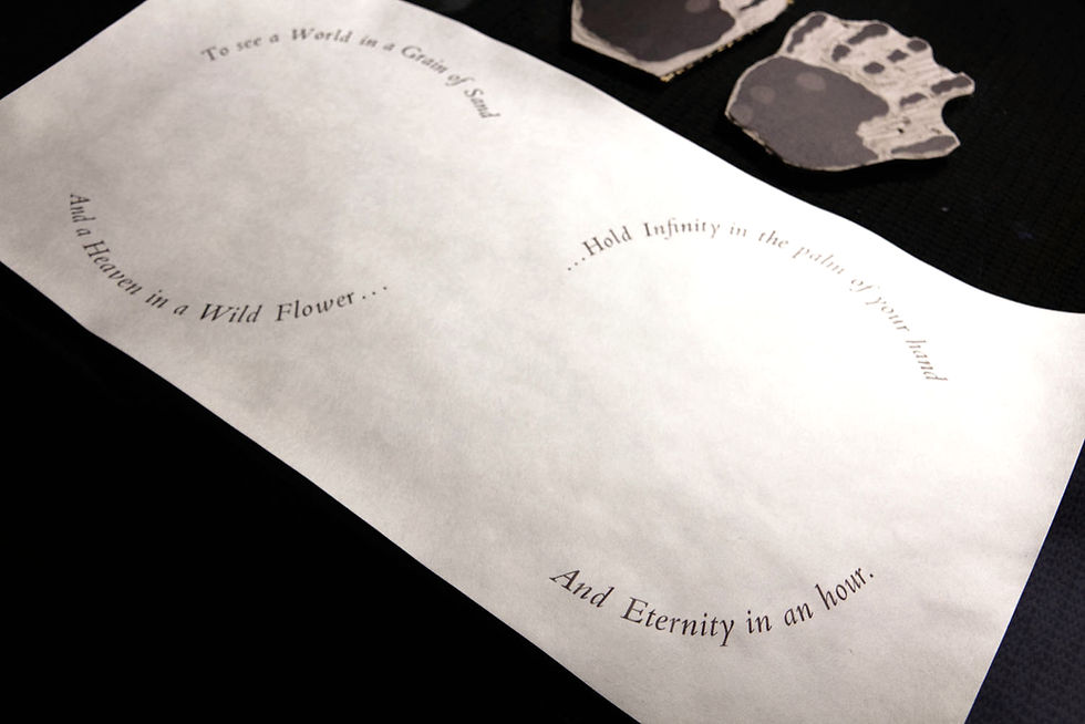
'The World in a Grain of Sand' - Pages 4 & 5
Since we love a challenge, most of the text in the visual companion will be arranged in array of shapes like curves and circles. Our first form of circular text posed several challenges that we later solved in an easier manner. As you can see in the picture, we cut a series of half circles using 16mm MDF then allowed space for the height of the type, this involved cutting out a section roughly the height of the type, which came in handy when it became apparent the empty space between words would need to be filled in, so we simply cut the waste to size.

The outer edges are secured with very large hose clamps that I happened to have in storage. They are the type you would possibly find in an automotive store for securing wide diameter engine inlet air ducting, but you can find them at hardware stores for plumbing purposes. Each circle has two hose clamps joined together end-to-end with space to secure the tensioners. In the middle, there are two quoins for providing optimal locking in tension with the outer clamps serving as an edge to push against. Everything is finished off with more circular ‘furniture’ made from the same piece of MDF.

The hand shapes are printed on the reverse of the pages to give the impression that they are ‘holding’ the flower and shell. I made the thumbs facing outward to hopefully give the impression as though the viewer is looking down at their own hands. I had to create a second shell since the first one was about 10mm too large for the hands. It looked OK on the mockup, but once it was proofed, it just didn’t balance properly with the rest of the image. Surprisingly, the biggest challenge of this signature was the little flower.
Aligning a fine object on multiple blocks with multiple points on a press made in the 1800s is quite a challenge. We persisted with the alignment woes for a while before deciding there was just a slight amount of movement in the Pearl (<.5mm) which is not a problem when combining layers of larger ‘less pointy’ objects, but it was just too much to reliably lock in the first block, let it dry, then lock in the second block only to see a slight amount of movement. Since we had already printed everything else on the pages, this was a big deal and we did not want to spoil all the work we had already completed.

The solution was to ‘do it the hard way’ which is as follows:
1. Hand ink and lock in Block 1 (gradient colour) and place in press
2. Place page in the press and register (with some small double-sided tape for extra security on back as well as registration)
3. Print Block 1
4. Keep page in the exact position (hence the tape)
5. Remove chase from press and Block 1 from chase
6. Lock in hand inked Block 2 exactly the same
7. Place Block 2 in press, (say a prayer or two) and print
We set up a hand inking station and the trusty Adana 8x5. Beck and I spent almost an entire day hand inking each page one at a time. The challenge was any movement once we inked the first layer, so the solution was to print the first layer, while keeping the page on the platen, remove the first layer form and lock in the second hand inked one in the same chase then place it back in EXACTLY the same way (including counting to the amount of turns on the quoins as even the smallest amount of flex can make a difference!)
The end result was satisfactory although we made a promise to take more consideration into the possible variation in layers and hopefully design accordingly. These are the kind of problems that really only emerge when you have committed to something requiring multiple tens of copies.
'Cuts the Airy Way' - Pages 6 & 7
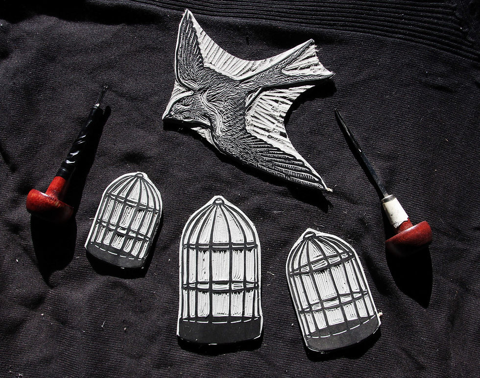
After pages 4 & 5, we decided to aim for something with more movement. We wanted to represent birds in cages but the cages were swinging about. For this, we tried a different method of locking the type in that Beck had read about a while earlier and would make this effect much easier since it's uneven and hose clamps would likely not be poossible. This approach involved cutting the shapes we want the text to follow along with the most important part being the actual line the text would follow. Once we were happy with that, I used my plunge router to create cavities on a piece of MDF that follow that same line, but have enough room to fit the type and extra room on top of each to allow fingers and tools to reach in.

The fastening method uses strong double-sided tape attached to the baseline and the bottom of each letter is simply ‘stuck’ to the tape… A far simpler method than the hose clamps. At first, we were both dubious this would not be enough and partially why we hadn’t tried it previously, but amazingly, it was quite a solid adhesion and since the press ideally only places light downward force on the type, it really wasn’t going to unsettle anything as long as the initial placement was sound, by ensuring each piece of type was attached against its flat top or bottom. The tape we used was ‘Gorilla’ brand. We did several tests of course and didn’t notice any issues so we proceeded with the run successfully while keeping an eye on any movement.
This method has opened up more possibilities since the clamp method can’t work in the same way as this one due to all the extra hardware getting in the way of everything else and the only way to resolve that would be to do even more print runs, and as it stands, each page is printed on no less than four times!

The imagery was relatively hassle free when compared to the previous pages. We again, were to feature birds but wanted some playful dynamic movement from page 6 to 7. The caged birds is a little reference to Blake's "A Robin Redbreast in a Cage Puts all Heaven in a Rage" from Auguries of Innocence, but since the line we are using in these pages is related to perception, we wanted to use the cage as a phychological symbol. The idea that the birds are flying 'free' but are also in cages is relevant to our time with so much of our own entrapment being in our minds. It raises questions like: When are we truly free? Is it important to be truly free, or is freedom in imagination only all that matters?
We aimed for page 7 to be in contrast with the grey muted colours of page 6 to indicate freedom of the uncaged Swallow flying free with all senses ablaze.

At this stage we are in the early phase of the next two pages. I have created the lino blocks and need to move into final page layout and typesetting. Beck is busy working on the essay while I work on a large commission illustration project. We will return to this blog periodically and update page by page. Thanks for reading and be sure to subscribe below for more updates as we progress!


Comments